Some people need charts and visuals to really make sense of the world. I see how it can sometimes be helpful to reduce the confusion of something big or complex into a series of connected boxes on an A3 piece of paper. In the corporate world, accountants have their ‘mud maps’, HR people have their ‘org charts’, management consultants have their ‘stakeholder maps’ and marketing people tend to have something brightly coloured and written in code, so that it doesn’t make sense to outsiders. But that’s just work. What if there were clever people who used their charting prowess to help us navigate and better understand the real world? Ta-da, here’s Pop Chart Lab.
The Lab began a couple of years ago, founded by a book editor and a graphic designer who joined forces with one modest goal in mind: to render all of human experience in chart form. Uh huh. Their range is amazing – they have tackled everything from beer to culinary devices to the story of a boy’s migration to a town called Bel Air. Here are some of my favourite prints (they also print their charts on t-shirts, in case you want to educate the masses).

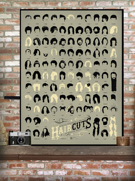
Oh yes, from Bill Haley in the top left to Lady Gaga in the bottom right corner, this is indeed A Visual Compendium of Notable Haircuts in Popular Music. It’s a signed, limited edition print that is sure to get people talking. And if you like this, you’ll probably like its cousin: A Visual Compendium of Notable Haircuts in Hollywood. (That one even includes Chewbacca’s impressive ‘do, along with several cast members of the Harry Potter franchise.)

And here’s the chart that I think is my favourite – a collection of 13 pie charts about pies. Yep, they’re breaking down the ingredients that go into those delicious desserts and it is just as scary as you might imagine. All the old favourites are there – including Fig. 12, Peanut Butter Pie, which is full of gooey goodness: by my calculations, almost 50% peanut butter, around 20% Oreos and almost as much butter, with a fair dose of heavy cream, vanilla extract and bittersweet chocolate. God bless America, I say. (If pies aren’t your thing, you might like The Delectable Kaleidoscope of Candy Bars – a pretty, colourful and super-detailed examination of the common ingredients and textures linking a bzillion different types of sweet treats.)

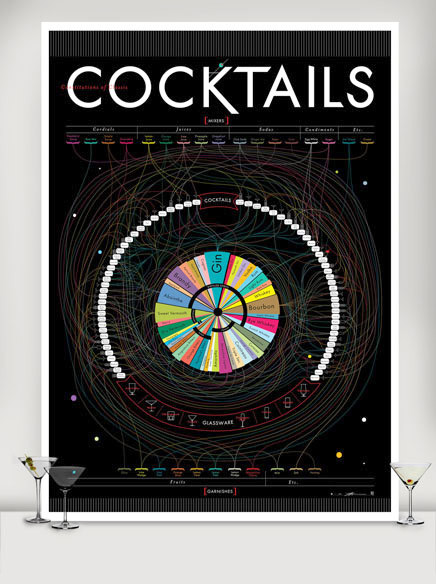
And finally, Constitutions of Classic Cocktails breaks down nearly 70 famous drinks into their constituent parts. Apparently, this is the most elaborate chart that the Lab folk have ever made – it is beautifully designed and unbelievably detailed. Whether you’re looking for inspiration to get shakin’, know a dedicated barfly with a birthday coming up, or just like the design, this is a good ‘un. I love it because to me it looks as though the cocktails are at the centre of a mysterious sort of galaxy. Or perhaps cocktails are like the Wheel of Fortune. And let’s face it, when the drinks are flowing, both of those statements are generally true.
If you’re thirsty for more info, you can check out many more educational works of art at the fabulous Pop Chart Lab site here.

Sparks – I’m with you. The pie-chart chart is my favourite. I suspect if we glazed those brussels sprouts in maple syrup (or something similar) I could convince you to eat them. I reckon you have a serious sweet tooth…
Tell you what, if you glaze them and bake them in a pie crust, I reckon I’ll give them another shot, TSL! 🙂
I love the haircuts one, it reminds me of that website where you could yearbook yourself, you just needed to load up a passport sized photo and you could become anyone from the 40’s through to the 80″s! It would be perfect for a hairdressing salon! All musical styles in one place!
Hahaha – yep, would love to see it in a salon, so you could request your style from the chart. “I’ll have the Barry Gibb thanks, Phillipe.” Or not! 🙂